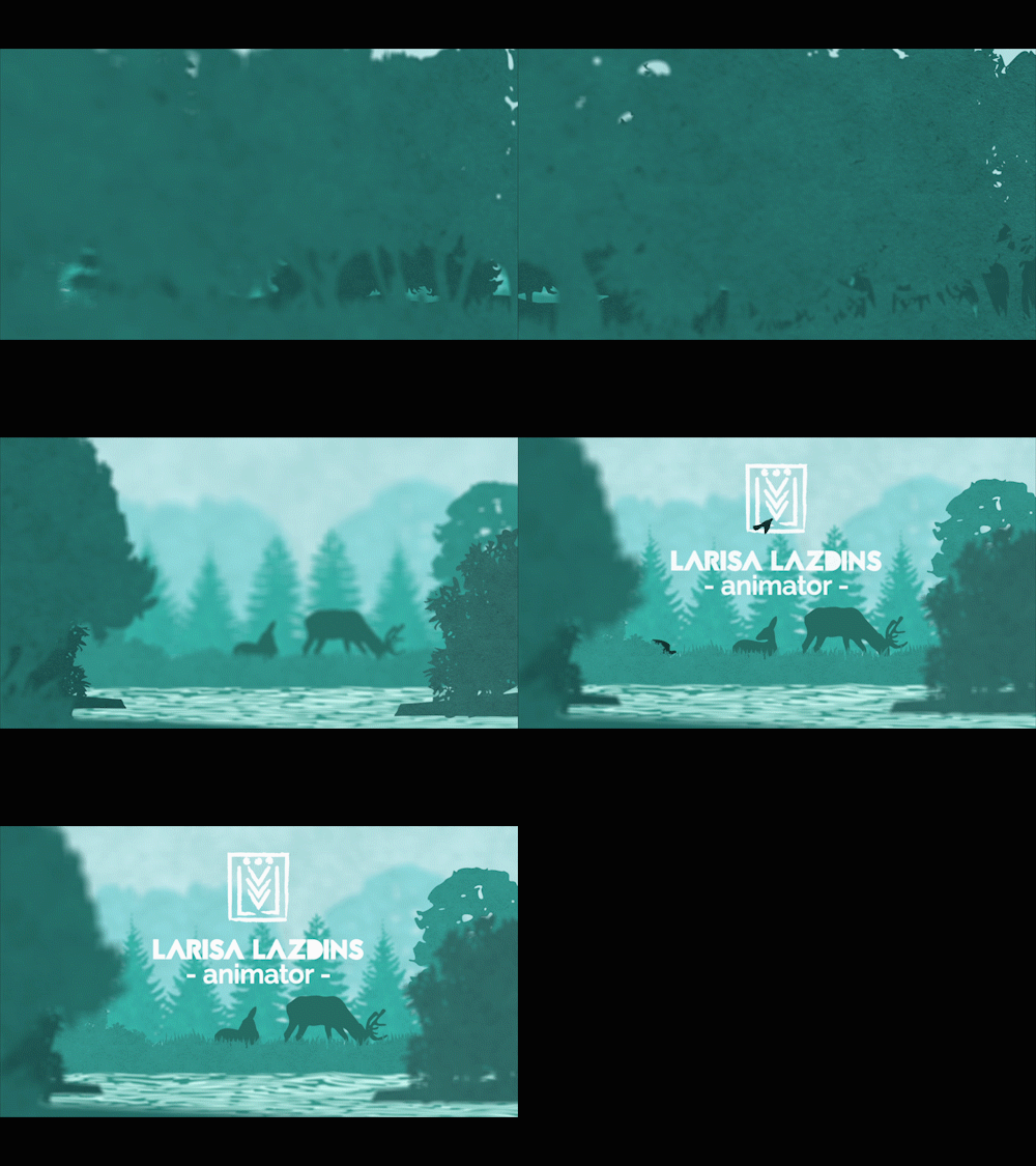
Somewhere in my mind I was inspired by the art work for a game called “Firewatch.” The artist who created it basically used 5 or 6 steps of colors, ranging from a dark orange-pink to a light orange-pink and I adored the simplicity of the idea. I thought, “Hey, I can probably animate something along those lines! Even make it into an intro for my demo reel!” I figured that since I was in a simplistic art style (not sure if it’s a phase yet, but I enjoy it) this would play nicely. Plus, I finally get back into using After Effects and expand a bit on my skills for that.
Assets were originally done/combined/colored based on how close I wanted that layer to the camera (dark for close, light for far) in Illustrator and then imported into After Effects. Each layer was made into a 3D layer and set back in steps of around 200 in most cases on the Z-axis. Layers were resized and re-positioned based on where I wanted them to end up based on the main focus point of the piece, which was a pair of deer and a few birds. I used a camera and animated it to get the feel that I wanted in terms of movement and focus.
At this point, there’s a bit of give and take in the process where I worked on multiple little parts at the same time. With the deer, I wanted to add some movement and really wanted to try to use AE’s puppet tools. Tried it and quickly found out that my computer does not have the capacity to use it, even on the simplest level, so I went the next best route: break apart parts of the deer in Illustrator and use anchor points in AE to get some movement going. Fine. I’m happy with how that turned out. Now the birds. I already know that using anchor points will give me something I don’t want for the flapping of the wings. So, after separating the different portions of the birds in Illustrator, I turned to Flash because it was quicker for me to manipulate shapes a little better. Even here, I did the quick-and-dirty shape morphing between one position to the next, which at the correct speed, looks pretty darn good. Let’s keep it. Lastly, was the water. I simply used AE’s Liquify in order to get the appearance of water flowing down river. Boom. Done.
Everything’s put back together and I’m not happy with the whole thing. I felt that it lacked texture. I had the idea of applying a paper-like texture to the trees. Just go back to the Illustrator layers and apply it, right? Wrong! I couldn’t get to work correctly, so I brought the layers separately into Photoshop to apply the paper-like texture and then brought the PSD files into AE in place of the Illustrator files. After a few minor tweaks, color corrections, and adding my name for my intro, I’m happy.
Postmortem: Looking back, I would probably play around a bit more with the Liquify effect and try to get a better handle on that. I could also play a bit more with depth with layers. I was a little afraid to expand on it due to my computer possibly not being able to handle with so much going on my screens to begin with. In a way I was limited with what I had, but I could have pushed it further.
Programs used: Adobe Photoshop, Adobe Illustrator, Adobe Flash, Adobe After Effects.


